9.63 is a creative studio founded on the belief that every business has a story to tell. Our approach is fueled by a deep sense of curiosity and a passion for discovery. In partnership with forward-thinking cultural and commercial brands, we help uncover their purpose, identify and clarify core values, and develop a foundation for future success. By leveraging tactical intuition, we create brand strategies and identity systems that engage deeply with the world we live in. Ultimately, we seek to produce thoughtful solutions that convey our clients’ brand essence and propel them into the forefront of modern culture.
Creative Partnership In Practice: Lisa Liu on Building an Agency Where One Victory Belongs to All
Interview
B-Sides
On her philosophy of partnership: “I think creating opportunities to work with people that really inspire and motivate you will take you down whatever path is right for you.”
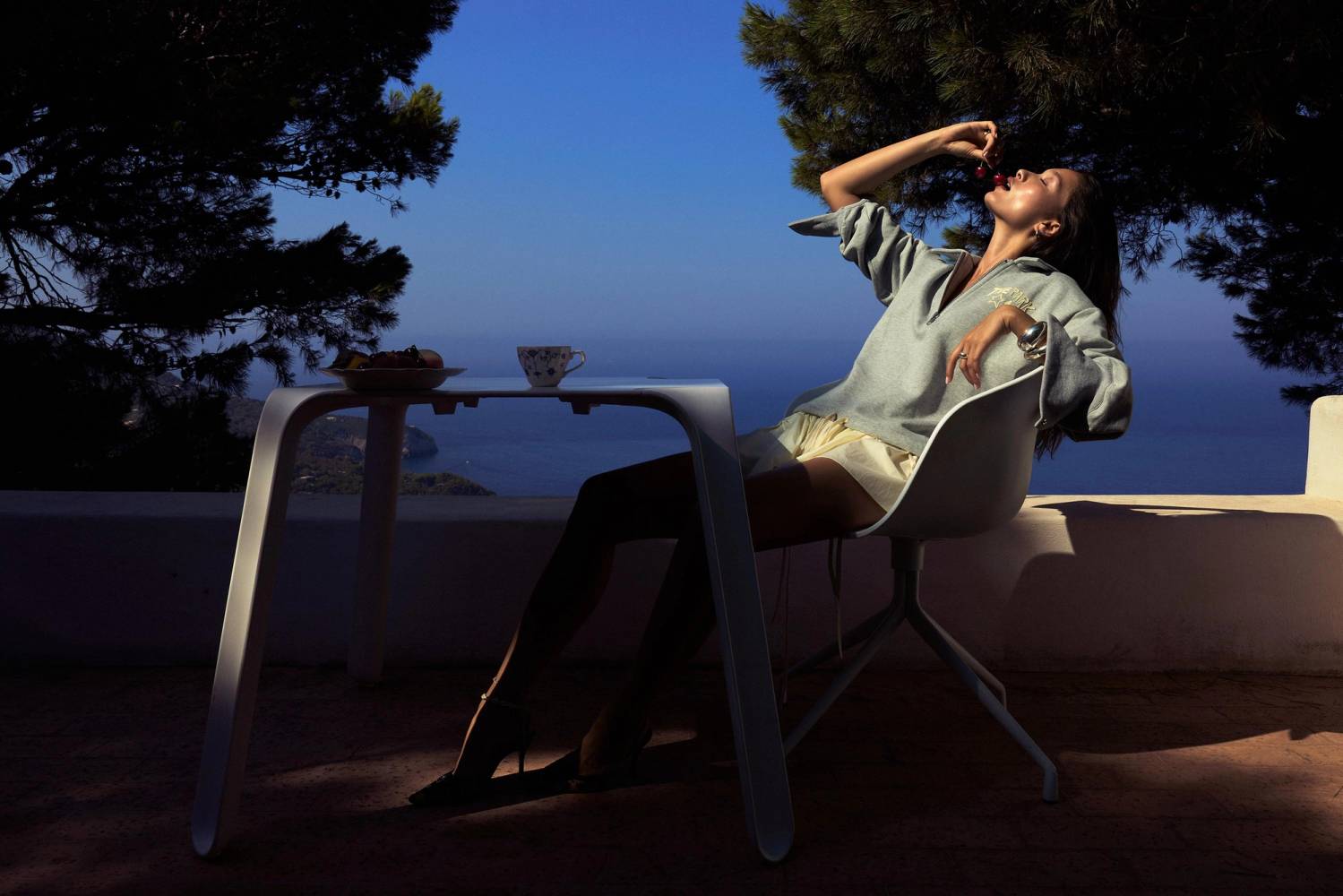
Campaign visuals from James Bee's collaboration with Tae Park.
On selecting artists for her roster: “There are three key things. First, I look for artists that have a very distinct style—something that catches my eye and feels like they have a very unique viewpoint. Second, they need to make sense within your roster. And third, they have to be equally motivated in their own career and actually want to partner with someone to grow.”
After spending years in San Francisco’s tech scene, Lisa’s pivot to artist management wasn't just a career change, it was a return to what felt meaningful. What started as helping her longtime friend James transition from in-house agency work to freelance evolved into co-founding an agency that manages photographers, directors, and stylists. Her approach blends strategy with care, supporting artists’ creative fulfillment while honoring their growth and future goals.
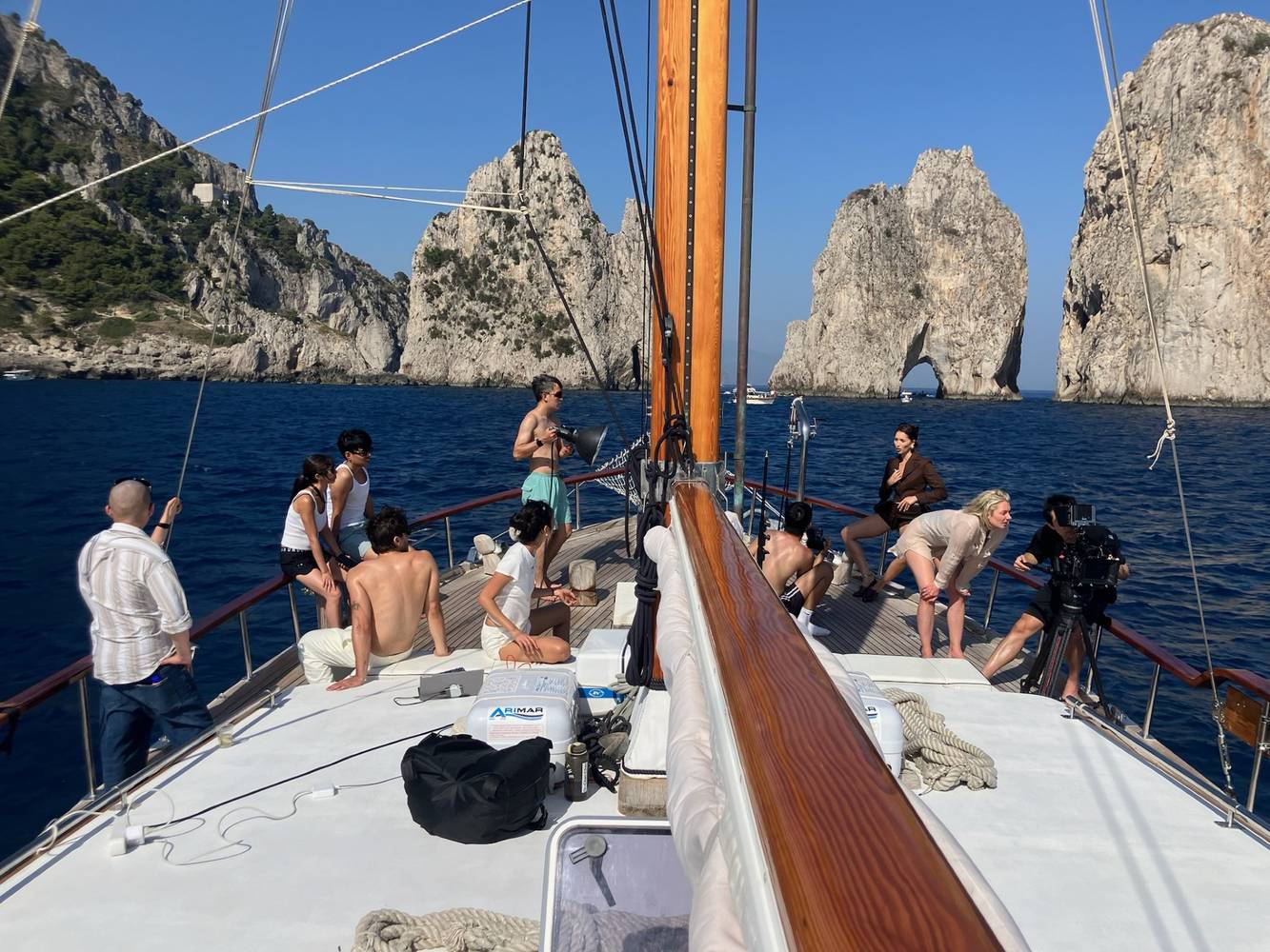
Behind the scenes: Lisa and her artists collaborating on the Italy short film project that would later be selected for the Mallorca Film Festival.
Continue reading to discover how key relationships—from mentor Annika Vogt to co-founder James—shaped her belief that combining business success with emotional honesty and meaningful partnerships is always the most authentic path forward.
This interview unpacks Lisa's shift from consulting to creative representation, her blend of strategy and instinct in growing the agency, and how she's built a business where artistic success and financial growth go hand in hand.
Want to read the full interview? Enter your email below to get access to the complete conversation plus future journal entries delivered to your inbox.
Our work for New York–based jewelry brand PerDiem has been featured on Contemporary Type. We're thrilled to see it recognized alongside other innovative and unique typographic work.
Creative Tension: Samson Ossedryver on Designing with Attitude
Interview
B-Sides
On his design approach: “I’m drawn to creating tension in my work, at times wanting something bold and striking, while also making it feel soft and quiet...It’s more reflective of real life, which isn’t always perfectly curated and designed.”
“I think attitude goes hand in hand with tension…I never want my work to feel like it doesn’t take a position.”
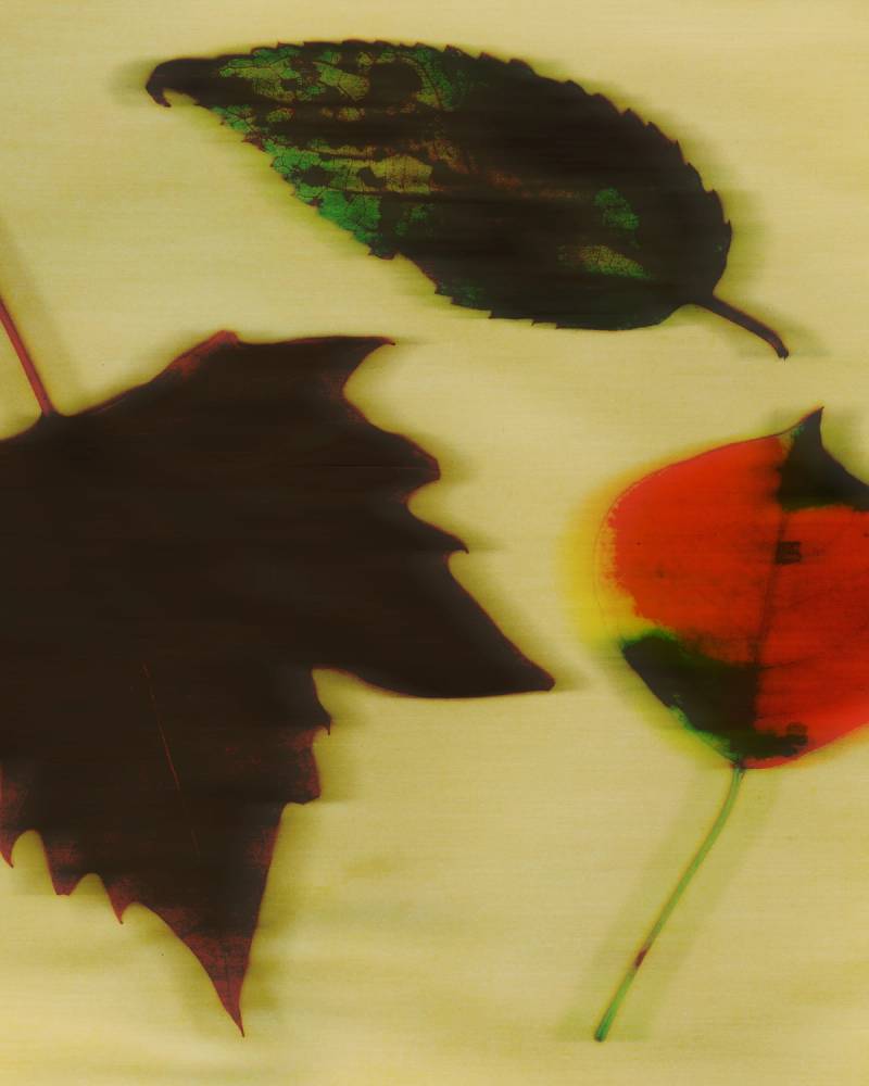
Project snapshots from Samson’s collaboration with Tsu Lange Yor.
On what “attitude” means in design: “I just want things to feel like they have a particular attitude. I don’t mean loud and abrasive all the time, but more that it takes a very clear position. I never want my work to feel like it doesn’t take a position.”
After experiencing burnout from studio life, Samson went solo to design on his own terms. His practice now thrives in the wrestle between boldness and restraint, structure and chaos. Beyond visual tension, what fuels him most is collaboration and the generative energy it sparks.
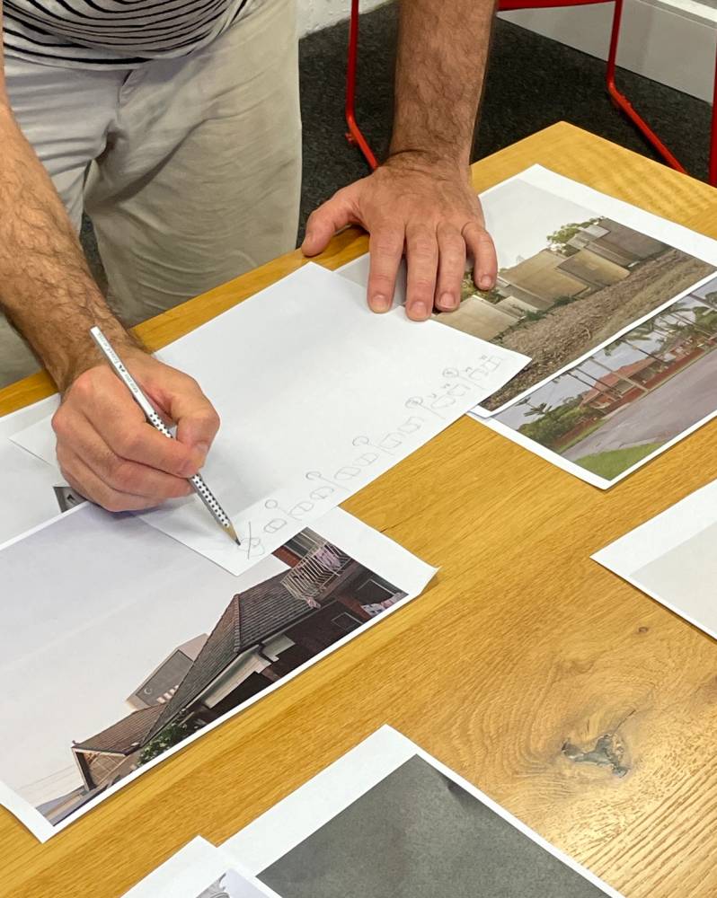
In the trenches: Samson and the Analogue Images team working through design concepts.
Subscribe and continue reading to discover how going independent transformed his client relationships, the advice that reshaped his entire approach to valuing his work, why he experiences the most anxiety during the creative process until everything finally clicks, and his perspective on work-life integration as a creative professional.
Completed layout design collaboration with the Justsmile team for their fifth and sixth issues. Working alongside Editor-in-Chief Kevin Hunter, Creative Director Bryce Thomas, and Art Director Anthony Bryant, we developed editorial spreads that celebrate Justsmile’s mission as an independent cultural publication at the intersection of fine art, fashion, and inclusivity. Our approach focused on flexible grid systems that could adapt to different content types while maintaining visual consistency across both issues.
Developed together with Dexin Chen and Samson Ossedryver.
Both issues are available online at justsmilemagazine.com, as well as through stockists including CASA Magazines and Iconic Magazines in NYC, and in over 50 stores nationwide and worldwide.
PerDiem Featured on Visuelle
Press
Brand Identity Development
Our branding project for PerDiem is featured on Visual Journal. The feature spotlights our typographic approach and how we built a systematic visual language for the New York–based jewelry brand.
Our branding project for PerDiem is featured on Visual Journal. The feature spotlights our typographic approach and how we built a systematic visual language for the New York–based jewelry brand.